6/3/2020

Categorical Predictors

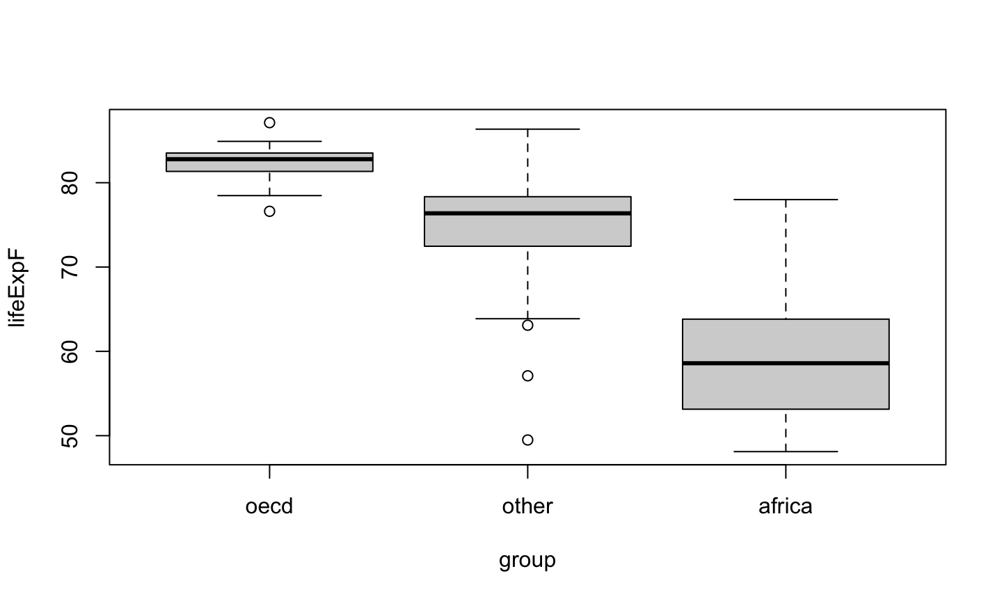
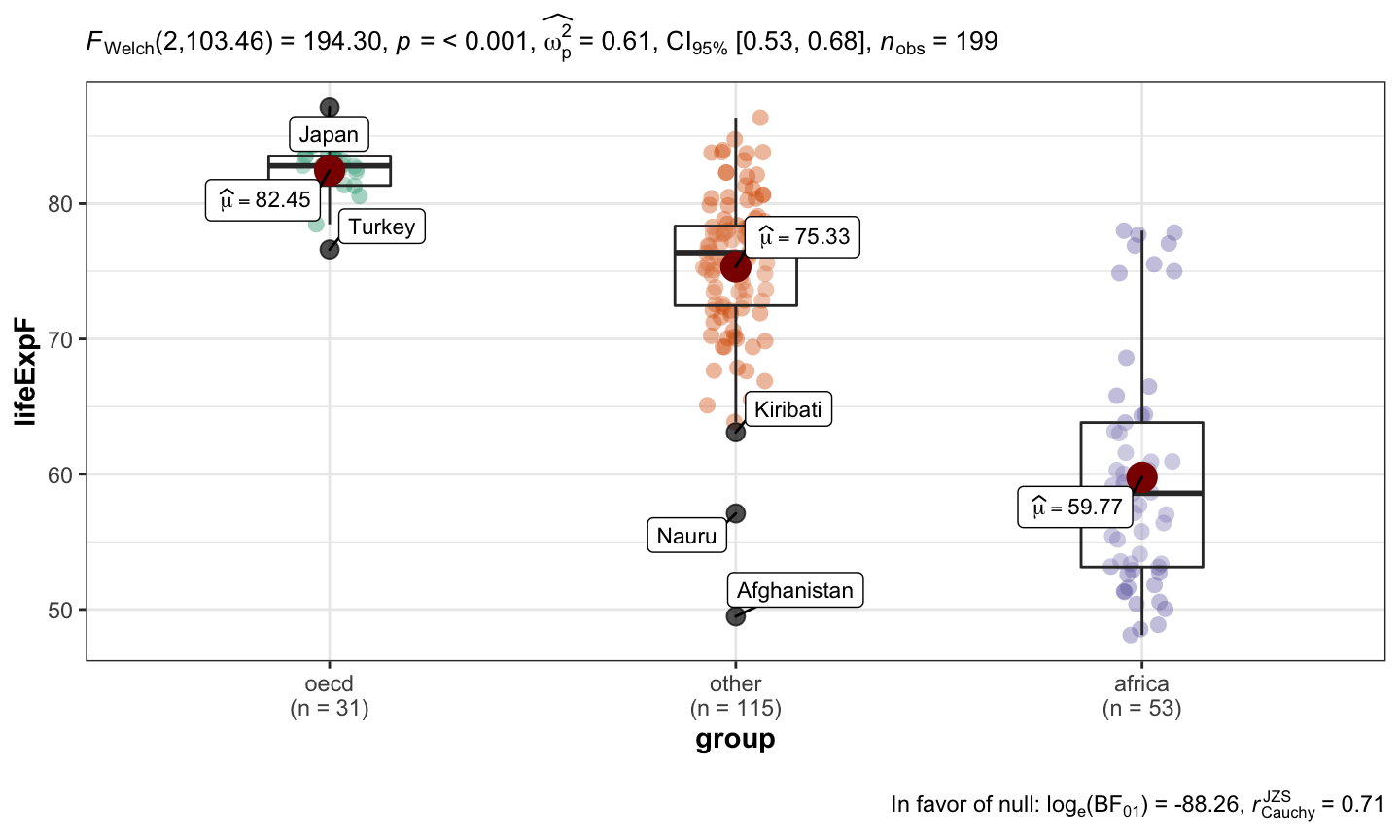
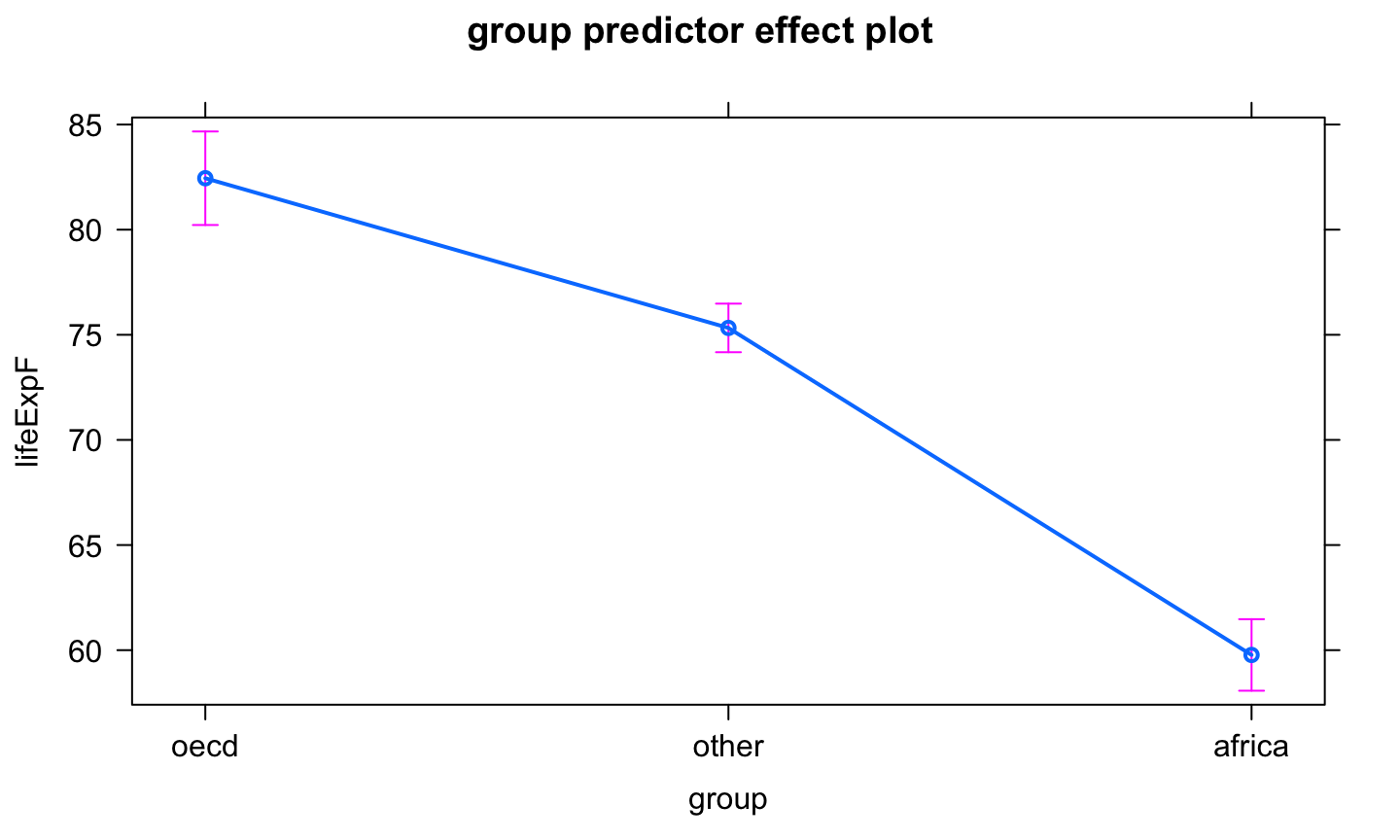
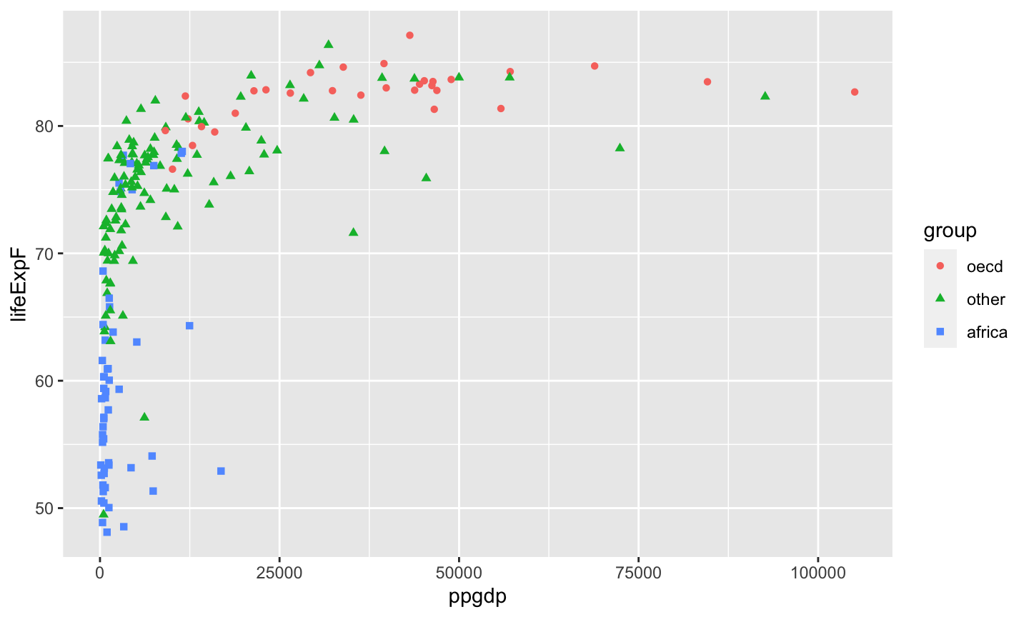
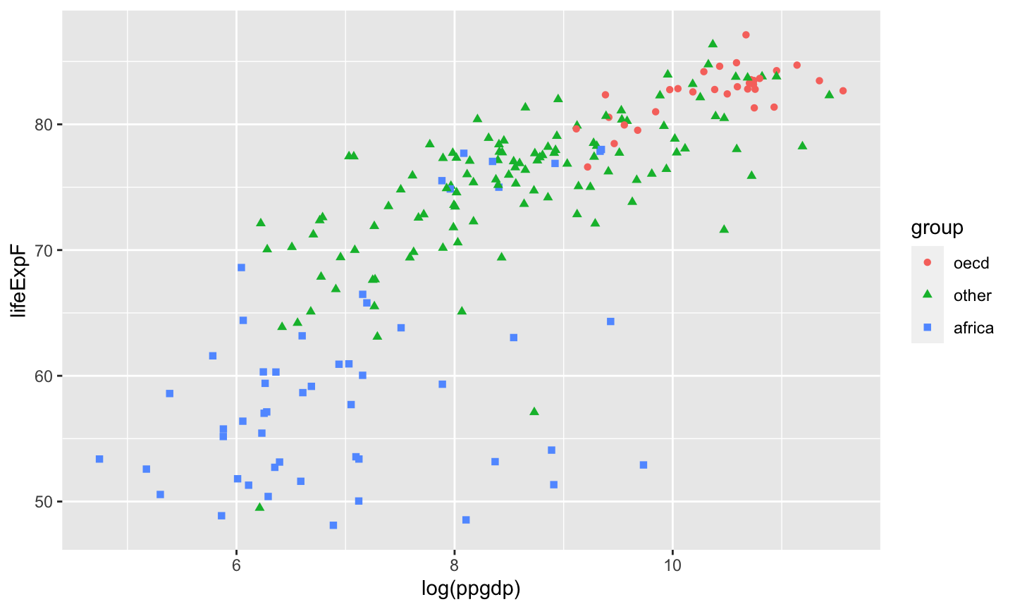
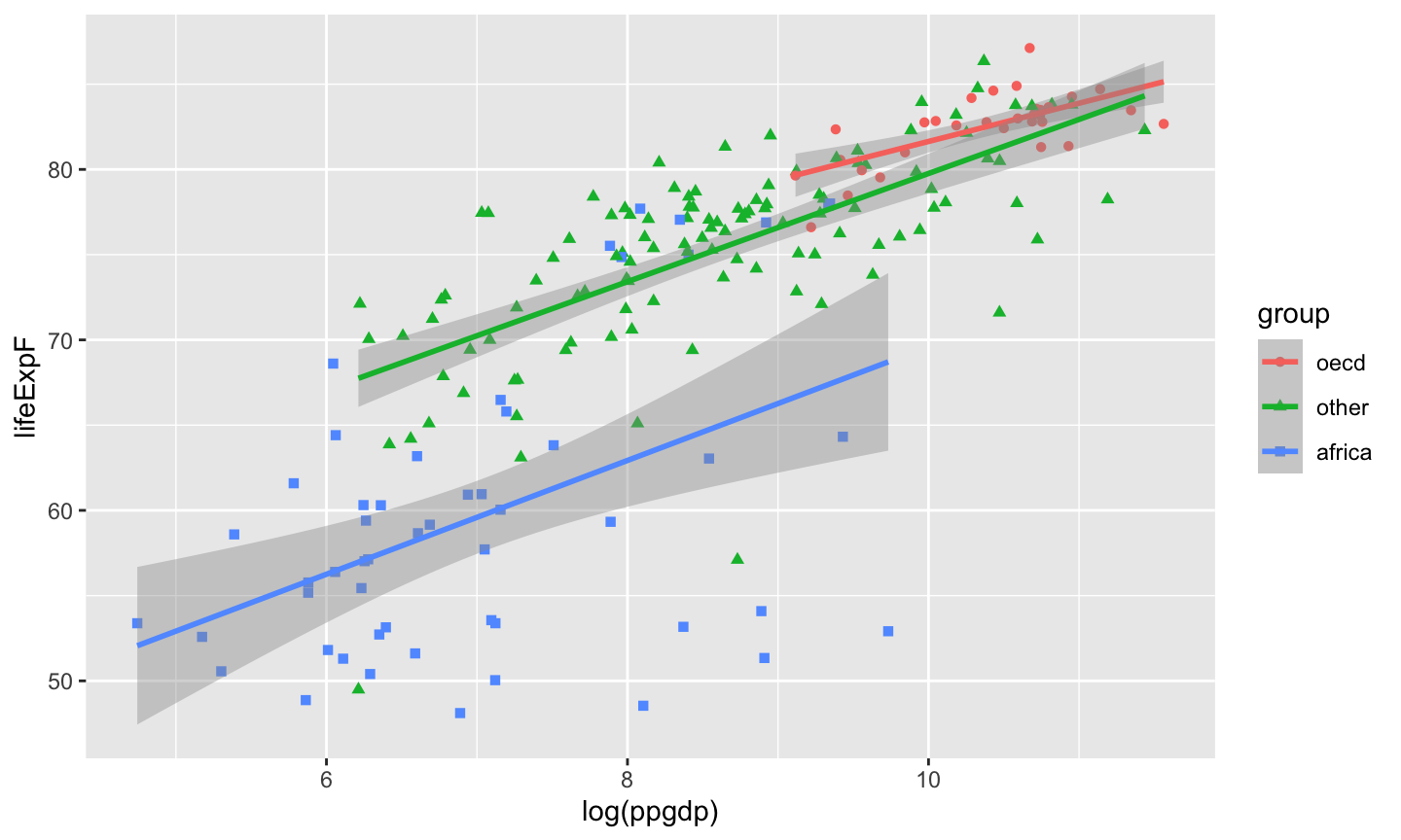
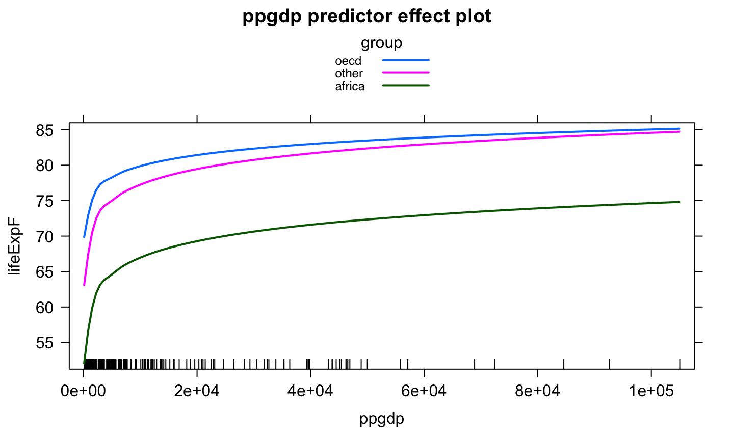
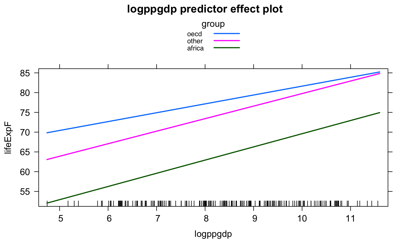
A categorical variable is a variable that can take on one of a limited, usually fixed, number of possible values, assigning each individual or other unit of observation to a particular group or nominal category on the basis of some qualitative property.

Categorical predictors are often called factors

Example: UN Data

Consider data from 199 localities (mostly members of the United Nations, but a few areas such as Hong Kong). The measured variables include:

  • ppgdp – the gross national product per person in U.S. dollars
  • fertility – average number of children per woman
  • lifeExpF – female life expectancy, years
  • pctUrban – percentage of population living in urban areas
  • group – a factor with level oecd for countries that are members of the Organization for Economic Cooperation and Development (OECD) as of May 2012, africa for countries on the African continent, and other for all other countries. No OECD countries are located in Africa.

Exploring Data for One-Factor Models

If the only predictor is a factor, then the regression model is called a one-factor or one-way design.

Boxplots of a one-factor model are useful for comparing different levels of each factor.

  • The thick middle line indicates the median value.
  • The box extends to the 25th and 75th percentiles. The distance between the quartiles is known as the interquartile range (IQR).
  • The whiskers generally extend to the most extreme values that are within 1.5 IQRs from the quartiles.
  • Values outside the whiskers are outliers and are indicated by a dot or star.

Boxplot Example

data(UN11, package = 'alr4')
boxplot(lifeExpF ~ group, data = UN11)

More Details

library(ggstatsplot)
UN11$country = row.names(UN11)
ggbetweenstats(data = UN11, plot.type = 'box',x = group, y = lifeExpF, outlier.tagging = T, outlier.label =  country)

What we get?

-The oecd countries generally have the largest female life expectancy, with africa having the lowest.

  • Nauru and Afghanistan have unusually low female life expectancy for the other group.

  • Japan has high female life expectancy, and Turkey has low life expectancy, compared to the other members of the oecd.

  • The variation of female life expectancy in oecd is smallest, but in africa is largest.

Defining Factors as Regressors

Defining Factors as Regressors

Dummy or indicator variables are used to include categorical predictors in a regression model.

A dummy variable \(U_j\) for factor level \(j\) is 1 if an observation has level \(j\), but 0 otherwise.

  • -1 and 1, or 1 and 2, are sometimes used, but this is less common and more difficult to interpret.
  • Assignment labels are mostly arbitrary and do not affect the results.

Since group has \(d=3\) levels, the \(j\)th dummy variable \(U_j\) for the factor \(j=1,2,…,d\) has \(i\)th value \(u_ij\), for \(i=1,2,…,n\), given by

\[u_{ij} = \begin{cases}1 & \text{ if group}_i = j\text{th category of group}\\ 0 &\text{ otherwise}\end{cases}\]

Try in R

levels(UN11$group)
## [1] "oecd"   "other"  "africa"
U1 = with(UN11, (group == levels(group)[1])+0)
U2 = with(UN11, (group == levels(group)[2])+0)
U3 = with(UN11, (group == levels(group)[3])+0)
head(data.frame(group = UN11$group, U1, U2, U3))
##    group U1 U2 U3
## 1  other  0  1  0
## 2  other  0  1  0
## 3 africa  0  0  1
## 4 africa  0  0  1
## 5  other  0  1  0
## 6  other  0  1  0

U_1 is the dummy variable for oecd, U_2 is the dummy variable for other, and U_3 for africa.

One-Factor Model

Regression coefficients are generally called effects in this setting.

How can we build a model using the form y=X+ϵ?

What would happen if we fit the model

\(E(lifeExpF│group)=\beta_0+\beta_1 U_1+\beta_2 U_2+\beta_3 U_3?\)

Why?

This is why!

In that case, \(X\) would be rank deficient since \(U_1+U_2+U_3=1\), which will always match the intercept.

  • The columns of \(X\) would be linearly dependent.

We only need \(d-1\) dummy variables to represent \(d\) levels because the last level represented when all the other dummy variables were 0.

  • Any of the \(d\) dummy variables could be excluded, though generally it is the first or last level.
  • R drops the first level by default.
  • The level dropped is known as the reference or baseline level.
  • In R, this method for creating the dummy variables is known as the treatment contrast.

A different solution

Other possibilities for avoiding linear dependence are:

  • Drop \(\beta_0\) from the model.
  • Assume \(\sum_{i=1}^{p-1}\beta_i =0\).
  • This is known as a sum contrast and does NOT use dummy variables.
  • Interpretation is generally more difficult.

Models

Using a treatment contrast with the first level of group as the reference level (oecd), our model becomes \[E(lifeExpF│group)=\beta_0+\beta_2 U_2+\beta_3 U_3.\]

Since group = oecd implies \(U_2=U_3=0\), \[E(lifeExpF│group=oecd)=\beta_0+\beta_2 0+\beta_3 0=\beta_0.\]

Since group = other implies \(U_2=1 \text{ and } U_3=0\), \[E(lifeExpF│group=other)=\beta_0+\beta_2 1+\beta_3 0=\beta_0+\beta_2.\]

Since group = africa implies \(U_2=0 \text{ and } U_3=1\), \[E(lifeExpF│group=africa)=\beta_0+\beta_2 0+\beta_3 1=\beta_0+\beta_3.\]

Fit in R

  • Method 1
lm(lifeExpF ~ U2 + U3, data = UN11)
## 
## Call:
## lm(formula = lifeExpF ~ U2 + U3, data = UN11)
## 
## Coefficients:
## (Intercept)           U2           U3  
##       82.45        -7.12       -22.67
  • Method 2
lm(lifeExpF ~ group, data = UN11)
## 
## Call:
## lm(formula = lifeExpF ~ group, data = UN11)
## 
## Coefficients:
## (Intercept)   groupother  groupafrica  
##       82.45        -7.12       -22.67

LifeExpF of different groups

  • \(\hat{E}(Lifeexpf│group=oecd)=\hat{\beta}_0=82.45.\)
  • \(\hat{E}(Lifeexpf│group=other)=\hat{\beta}_0+\hat{\beta}_2=82.45-7.12=75.33.\)
  • \(\hat{E}(Lifeexpf│group=africa)=\hat{\beta}_0+\hat{\beta}_3=82.45-22.67=59.79.\)

Interpretation

lm(lifeExpF ~ group, data = UN11)
## 
## Call:
## lm(formula = lifeExpF ~ group, data = UN11)
## 
## Coefficients:
## (Intercept)   groupother  groupafrica  
##       82.45        -7.12       -22.67

Interpretation

lm(lifeExpF ~ group, data = UN11)
## 
## Call:
## lm(formula = lifeExpF ~ group, data = UN11)
## 
## Coefficients:
## (Intercept)   groupother  groupafrica  
##       82.45        -7.12       -22.67
  • The expected female life expectancy for OECD nations is 82.45 years.
  • The expected female life expectancy for other nations is 7.12 years less than nations in OECD.
  • The expected female life expectancy for African nations is 22.67 years less than nations in OECD.

Interesting Facts

  • \(\hat{\beta}_0\) is simply the sample mean of the responses in the oecd group.
  • \(\hat{\beta}_2\) is the difference between the sample mean of the responses for the other group and the oecd group.
  • \(\hat{\beta}_3\) is the difference between the sample mean of the responses for the africa group and the oecd group.
with(UN11, tapply(lifeExpF, group, mean))
##     oecd    other   africa 
## 82.44645 75.32674 59.77226

Effect Plot

library(effects)
## Loading required package: carData
## lattice theme set by effectsTheme()
## See ?effectsTheme for details.
lmod1 = lm(lifeExpF ~ group, data = UN11)
plot(predictorEffect('group',lmod1))

Pairwise comparison

library(emmeans)
group.emm.s = emmeans(lmod1, specs = 'group')
knitr::kable(pairs(group.emm.s))
contrast estimate SE df t.ratio p.value
oecd - other 7.119708 1.270907 196 5.60207 2e-07
oecd - africa 22.674187 1.419998 196 15.96776 0e+00
other - africa 15.554479 1.042641 196 14.91835 0e+00

Factors and Quantitative Predictors

It is common to study the effect of a factor AFTER adjusting for one or more other quantitative regressors.

If we have a mixture of factors and quantitative variables in our data, it’s useful to create a scatterplot of the response versus the covariate that distinguishes the observations for each level.

  • This helps us assess whether the relationship between the response and quantitative regressor differs for the levels of the factor.

Scatter Plot

library(ggplot2)
ggplot(data = UN11, aes(x = ppgdp, y = lifeExpF, col = group, shape = group))+
  geom_point()

Helpful One

ggplot(data = UN11, aes(x = log(ppgdp), y = lifeExpF, col = group, shape = group))+
  geom_point()

What we see?

  • The linear relationship between lifeExpF and log(ppgdp) is fairly weak for the africa locations
  • The linear relationship is reasonably strong for the other locations
  • The linear relationship is reasonably strong for oecd locations.
  • It’s unclear whether the average rate of change between lifeExpF and log(ppgdp) (the slope) is the same for the three factor levels.
  • The average lifeExpF seems to differ vertically for the same levels of log(ppgdp) for the different factor levels.

Different Models to Consider

Suppose we have a response \(y\), a quantitative regressor \(x\), and a two-level factor variable represented by a dummy variable \(u\):

\[u = \begin{cases}0 & \text{ for the reference level}\\ 1 & \text{ for the treatment level.}\end{cases}\]

Consider several possible regression models:

  • The same regression line for both levels, y=β_0+β_1 x+ϵ.
    • In R: y ~ x
  • A factor predictor but no quantitative predictor, y=β_0+β_2 u+ϵ.
    • In R: y ~ u
    • This is a one-way model.

Different Models to Consider

  • Separate regression lines for each group having the same slope, \(y=\beta_0+\beta_1 x+\beta_2 u+\epsilon\).
    • In R: y ~ x + u.
    • This is known as a parallel lines or main effects model.
    • \(\beta_2\) represents the vertical distance between the regression lines (the effect of the treatment).
  • Separate lines for each group with different slopes, \(y=\beta_0+\beta_1 x+\beta_2 u+\beta_3 xu+\epsilon\).
    • In R: y ~ x + u + x:u or y ~ x*u
    • This is known as a separate lines or interaction model.
    • x:u means the interaction between \(x\) and \(u\).
    • x*u means the cross between \(x\) and \(u\) (\(x\), \(u\), and the interaction between \(x\) and \(u\)).

Example

lmodi = lm(lifeExpF ~ group*log(ppgdp), data = UN11)
head(model.matrix(lmodi))
##             (Intercept) groupother groupafrica log(ppgdp) groupother:log(ppgdp)
## Afghanistan           1          1           0   6.212606              6.212606
## Albania               1          1           0   8.209907              8.209907
## Algeria               1          0           1   8.405815              0.000000
## Angola                1          0           1   8.371450              0.000000
## Anguilla              1          1           0   9.528801              9.528801
## Argentina             1          1           0   9.122831              9.122831
##             groupafrica:log(ppgdp)
## Afghanistan               0.000000
## Albania                   0.000000
## Algeria                   8.405815
## Angola                    8.371450
## Anguilla                  0.000000
## Argentina                 0.000000

Example

library(knitr)
kable(summary(lmodi)$coefficients)
Estimate Std. Error t value Pr(>|t|)
(Intercept) 59.2136614 15.220345 3.8904284 0.0001377
groupother -11.1731029 15.594836 -0.7164617 0.4745723
groupafrica -22.9848394 15.783786 -1.4562310 0.1469536
log(ppgdp) 2.2425354 1.466444 1.5292337 0.1278438
groupother:log(ppgdp) 0.9294372 1.517667 0.6124117 0.5409862
groupafrica:log(ppgdp) 1.0949810 1.578460 0.6937019 0.4887032

Example

lm(lifeExpF ~ log(ppgdp), data = UN11[UN11$group=='oecd',])$coefficients
## (Intercept)  log(ppgdp) 
##   59.213661    2.242535
lm(lifeExpF ~ log(ppgdp), data = UN11[UN11$group=='other',])$coefficients
## (Intercept)  log(ppgdp) 
##   48.040558    3.171973
lm(lifeExpF ~ log(ppgdp), data = UN11[UN11$group=='africa',])$coefficients
## (Intercept)  log(ppgdp) 
##   36.228822    3.337516

Example

\[\hat{E}(lifeExpF│ppgdp=x,group=oecd)= \]

\[\hat{E}(lifeExpF│ppgdp=x,group=other)= \]

\[\hat{E}(lifeExpF│ppgdp=x,group=africa)= \]

Example

ggplot(data = UN11, aes(x = log(ppgdp), y = lifeExpF, col = group, shape = group))+
  geom_point() + geom_smooth(method = 'lm')
## `geom_smooth()` using formula 'y ~ x'

Effect Plot

par(mfrow = c(1,2))
plot(predictorEffect('ppgdp',lmodi), lines = list(multiline = T))

Effect Plot with Transformation

UN11$logppgdp = log(UN11$ppgdp)
plot(predictorEffect('logppgdp',lm(lifeExpF ~ group*logppgdp, data = UN11)), lines = list(multiline = T))

Main Effect Model

Examining the fit of the interaction model to the data suggests that the slope might be the same for all groups.

A main effects model assumes the slope is the same for all factor levels but allows each group to have its own intercept.

  • Main effects models are easier to interpret since the effect of the quantitative regressor is the same for all levels of the factor.
  • This model is called the Analysis of Covariance (ANCOVA) when the factor levels indicate a randomly assigned treatment for subjects.

Example

lmodm = lm(lifeExpF ~ log(ppgdp) + group, UN11)
kable(summary(lmodm)$coefficients)
Estimate Std. Error t value Pr(>|t|)
(Intercept) 49.529241 3.3995539 14.569335 0.0000000
log(ppgdp) 3.177320 0.3159597 10.056092 0.0000000
groupother -1.534683 1.1736824 -1.307579 0.1925556
groupafrica -12.170365 1.5574486 -7.814297 0.0000000

Plot

ggplot(data = UN11, aes(x = log(ppgdp), y = lifeExpF, col = group, shape = group))+
  geom_point() + geom_smooth(method = 'lm', mapping= aes(y = predict(lmodm, UN11)))
## `geom_smooth()` using formula 'y ~ x'